| Sour Grapes |
| Of course we're Fair and Balanced! |
|
|
||
|
Opinions are the author's and are not necessarily shared by Blogger, SDF, my employer or my family, but they should be.
Blogs and such
e-mail lists
Other Results of 2 Nov 2004 General Election (winners in bold; click on office for more detail)
Tools |
2005-02-10
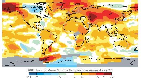
Global warming Earth Observatory has some interesting data that seem, to me, to indicate rather strongly that things are heating up here on Earth. This image represents a portion of that data. The graph on the referenced page is the clincher. Of course the important question is, Why are temperatures rising? There's good evidence for a 100,000-year cycle of higher and lower temperatures (the latter being known as Ice Ages). 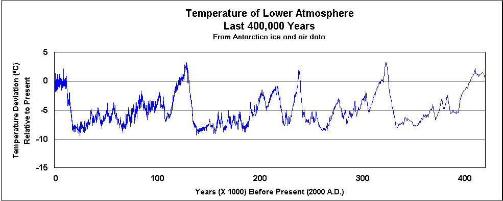
Here (from geocraft.com, as is the image below) is a graph of temperatures in the lower atmosphere over the last 400,000 years, as inferred from ice core samples from Antarctica. These are from a web page (to which the images link) that looks at the correlation of temperature and CO 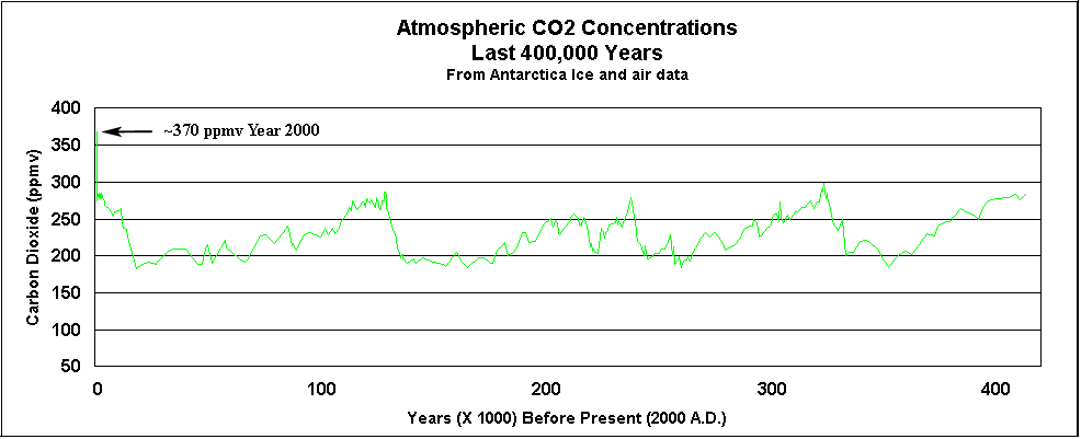
OK, so the theory of greenhouse gases leading to higher global temperatures is just that — a theory, an unproven theory. The EPA's global warming site makes this point. But considering what the consequences might be if the theory is even partly correct, shouldn't we be doing much more than we are to reduce those gases?
Justice (Civil Liberties, so-called Intellectual Property, Privacy & Secrecy); Politics & Government (International, National, State, Local); Humor (Irony & the Funny or Unusual); Science & Technology (Astronomy, Computers, the Internet, e-Voting, Crypto, Physics & Space); Communication (Books, Film, Media, Music & the English Language); Economics (Corporatism & Consumerism); and Items of Purely Personal Note (including Genealogy, Photography, Religion & Spirituality). |